The interactive icons above or the menu at left will connect you to our selected collection of work, all representing our dedication to the creation and promotion of powerful brand identity. We welcome you to browse through our solutions to past challenges, and invite you to consider how we could bring successful results to your brand. Click on arrows or slider bar to pan through brand icons.

Thanks for visiting!

Chef Aarón Sánchez partnered with Del Real Foods® to develop a signature line of authentic Mexican dishes to be offered in club stores. They needed a unique identity to clearly differentiate his line of products from anything else under the Del Real brand.

With a prominent portrait of the well-known chef featured below his bold logomark, appetizing product imagery and colorful panels across the top to identify the varieties at a glance, our strong, contemporary package design was key to its successful launch and acceptance into its intended market, resulting in plans to expand to retail markets as well.

Services Provided:

•Brand Identity •Package Design •Photo Retouching •Line Extensions •3D Image Generation •Final Art Production

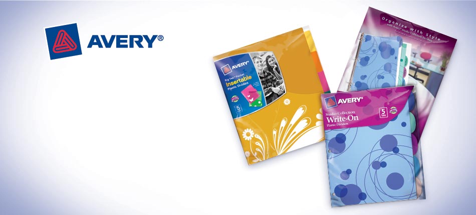
The packaging designed for the vast array of Avery® home, school and office products requires a combination of creative flair to be noticed and appeal to the target consumer amid the clutter of the competition, as well as clear and organized communication of the many features and benefits the products have to offer. At the same time delivering the brand consistency and product segmentation required to provide ease of shopability for consumers.

We’ve had a long-standing working relationship with Avery, consistently providing attractive and informative packaging that delivers the results they require to stay on top in their markets.

Services Provided:

•Package Design •Logo Design •Photography •Photo Supervision •Retouching •Illustration •Name Generation •Copywriting •Line Extensions •3D Image Generation •Final Art Production

Camaronazo® is a tomato & shrimp cocktail drink with a bilingual label for distribution in Mexico and the US. Our redesign added appetite appeal and excitement, emphasizing the refreshing splash of water in the background, adding ice to the glass full of product and bringing it closer to the forefront with an inviting tilt. We also redesigned the logo, giving it a more dynamic presence, and brightened the overall label, giving it a better pop off the shelf. All while conforming to strict FDA labeling guidelines.

Services Provided:

•Brand Identity •Logo Design •Package Design •Photography •Photo Supervision •Retouching •Illustration •Line Extensions •3D Image Generation •Final Art Production

Carapelli® was a well-known brand in Italy with plans to develop a line of olive oils designed specifically for an unfamiliar U.S. market. Their goal was to convey the rich Italian heritage of a traditional family-run operation with a passion for the land and its harvest.

The resulting label designs not only clearly communicated those messages, but also provided strong varietal differentiation and a heightened sense of product quality to a consumer completely unfamiliar with the brand and somewhat uninformed about olive oil in general.

Services Provided:

•Brand Identity •Logo Design •Package Design •Illustration •Copywriting •Line Extensions •3D Image Generation •Final Art Production •Print Supervision

The Martinez family had developed a line of authentic gourmet salsa varieties that they hoped to expand from their limited distribution in Mexico. They wanted to start fresh with a completely new identity, including a new brand name, logo and label design.

The brand mark of the engraved gold shield with their name prominently yet tastefully displayed, along with the strong flavor identification through the use of jeweltone colors and realistic ingredient illustrations, combined together to provide the upscale image of an established brand the Martinez family needed to gain shelf space in the competitive salsa category.

Services Provided:

•Brand Identity •Logo Design •Package Design •Illustration •Line Extensions •Name Generation •3D Image Generation •Web Design •Final Art Production •Print Supervision

The Cedarlane® name represents deliciously prepared foods made with healthy, natural ingredients. We were asked to extend their product line to include a wide variety of new items and container types while maintaining their established brand identity.

We met the challenge of creating new, appetizing product imagery and appropriate sub-branding for each item while clearly communicating their extensive product benefits without creating clutter, making an easier choice for the consumer.

Services Provided:

•Sub-Brand Identity •Package Design •Photography •Photo Supervision •Retouching •Line Extensions •3D Image Generation •Final Art Production •Print Supervision

Charlie’s Pride® first came to us to develop a retail package for their line of foodservice entrée products. We created a carton with dual front panels, enabling them to display their package either vertically or horizontally, allowing flexibility for shelving their line to gain expanded visibility. Strong color coding and appetizing product imagery for each variety provided clear differentiation and enhanced appeal to consumers.

We’ve continued to work with Charlie’s Pride on numerous packaging and promotional projects, not only for their own brand, but also for a number of co-packing ventures requiring different brand identities.

Services Provided:

•Brand Identity •Package Design •Logo Design •Name Generation •Photography •Photo Supervision •Retouching •Illustration •Line Extensions •3D Image Generation •Promotional Materials •POS Displays •Vehicle Wraps •Web Design •Final Art Production •Print Supervision

When Chef Boyardee® needed label designs for a line of newly developed kid’s products, we delivered labels with strong branding, impactful sub-branding, clear flavor differentiation, and lots of fun! We also created a Mini-Bites line to distinctively segment some of their existing products into an identifiably unique sub-brand, while at the same time enhancing appetite appeal. This later led to a series of successful promotional packs including partnerships with major movie studios.

Services Provided:

•Sub-Brand Identity •Logo Design •Package Design •Photography •Photo Supervision •Retouching •Illustration •Line Extensions •3D Image Generation •Promotions •Final Art Production

D’Gari had a line of gelatin mix varieties packaged in clear plastic pouches with minimal graphics. With plans to expand their product line and increase sales in both Mexico and the US, they needed impactful packaging in two languages to meet their goal.

We provided fun, colorful cartons that not only led to increased shelf space, but in an envied position just below the number one gelatin brand in the market. We later developed additional packaging for a line of single serve ready-to-eat gelatin snacks intended for distribution in Mexico only. With brightly colored fruit and gelatin cubes applied to the sleeve and descending cups, shelf impact increased dramatically.

Services Provided:

•Package Design •Photography •Photo Supervision •Retouching •Illustration •Line Extensions •3D Image Generation •Promotional Material •POS Displays •Final Art Production

When the Dean’s® line of refrigerated dips was in need of a facelift to increase their sales against some strong competitors, we provided a more lively logo with distinctive flair, and enhanced appetite appeal that featured the product in use. A strong understanding of the sometimes limiting printing method resulted in improved color and detail in the images created to differentiate each variety.

The successful results led to further growth for the brand, including the development of additional product lines and varieties to increase their shelf presence.

Services Provided:

•Brand and Sub-Brand Identities •Logo Design •Package Design •Illustration •Line Extensions •3D Image Generation •Final Art Production •Print Supervision

Del Real Foods® produces a wide variety of packaged Mexican foods based on traditional, authentic recipes. We’ve reflected that heritage in the packaging we’ve developed for them by carefully merging their logo with culturally appropriate graphic details and color choices, combined with a prominent display of appetizing product photography.

Their continued success has brought us additional work as they expand their offerings to more varieties, sizes and products.

Services Provided:

•Package Design •Photography •Photo Supervision •Retouching •Illustration •Line Extensions •3D Image Generation •Final Art Production •Print Supervision

Disney required a unique cover format for selected titles in their animated line to create a Masterpiece Collection. Simultaneously, we designed an embellished version specifically for Snow White’s landmark debut to video. Both included holographic foil accents to enhance shelf presence and add a touch of Disney magic.

The success of this project led to numerous others with Disney, as well as the rare approval to be one of only a few vendors allowed to illustrate their animated characters.

Services Provided:

•Brand Identity •Logo Design •Package Design •Illustration •Line Extensions •3D Image Generation •Final Art Production

When Don Miguel® needed a package for club-store distribution with its own distinctive, upscale and healthy image to represent their new All Natural line under the Gourmet Olé® sub-brand, we delivered. With only two days before their presentation to Costco, we developed the package design, as well as the Gourmet Olé logo.

With its enthusiastic acceptance, the brand has since relied on us to help develop their continually expanding line of products, taking care to delineate the varying category segmentation, yet still maintain a strong family connection with every package. With resulting sales increasing by as much as 40% for some products, we continue to be part of their extended success story.

Services Provided:

•Brand Identity •Logo Design •Package Design •Photography •Photo Supervision •Retouching •Illustration •Copywriting •Line Extensions •3D Image Generation •Advertising •Final Art Production •Print Supervision

DreamWorks™ requested graphics to create a new segment in their line of DVD’s clearly differentiating the animated titles from the standard features. We designed not only the DreamWorks Animation™ logo, but also the framework that surrounds and interacts with the feature characters, as well as the gold seal device highlighting each feature’s unique selling points.

The system successfully segmented their line, plus it provided a recognizable signature look for the discerning consumer.

Services Provided:

•Brand Identity •Logo Design •Package Design •Line Extensions •3D Image Generation •Final Art Production

The Flush ‘n Sparkle™ product for Fluidmaster® had a significant difference from competing drop-in toilet bowl cleaners. Because the connectors from the holding device allow the cleaning product to bypass the tank water, corrosion of the tank parts is ingeniously avoided.

Our design included an illustration clearly demonstrating that advantage, along with strong color coding to differentiate between the three formulas offered.

Services Provided:

•Logo Design •Package Design •Photography •Photo Supervision •Retouching •Illustration •Line Extensions •3D Image Generation •Final Art Production •Print Supervision

Frankly Fresh™ products are packaged fresh food items sold in club & retail stores. Their packaging needs to communicate fresh, delicious and natural, as well as define the often long list of product benefits, plus clearly distinguish the many varieties within any one product line.

We’ve helped the brand extend their family of products and expand their distribution to new markets and customers with successful results.

Services Provided:

•Package Design •Photography •Photo Supervision •Retouching •Line Extensions •3D Image Generation •Final Art Production •Print Supervision

Fresh Food Concepts® offers an extensive line of refrigerated, fresh-packed, all-natural products including salsas, dips & salads. With a wide array of sizes, varieties and types of products, they needed a design firm that could not only handle their volume, but also understand their packaging needs for shelf impact, differentiation and appetite appeal.

We’ve provided packaging to suit all their needs, from new products in need of a unique fresh look, to quick minor changes in size or formula. Inviting imagery and clear communication of product benefits has kept their brand in strong demand.

Services Provided:

•Package Design •Photography •Photo Supervision •Retouching •Illustration •Line Extensions •3D Image Generation •Final Art Production •Print Supervision

The product line for Full Life™ had a great brand name, but not a strong brand identity. We developed a uniquely recognizable logo and packaging format to create impactful individual pouches and a strong collective shelf impression to stand out and be noticed.

The new design enhanced shopability for the consumer, simplifying and organizing the many different benefits, descriptions and varieties in a more logical way in order to be quickly found and clearly understood.

Services Provided:

•Brand Identity •Logo Design •Package Design •Photography •Photo Supervision •Retouching •Illustration •Line Extensions •3D Image Generation •Final Art Production

Gardenburger® enlisted our help to revive their natural, homegrown image to counteract the sharp drop in sales following their previous design that veered much too slick and corporate. We incorporated more muted, natural colors, a funkier font and playful graphics to reflect their image of more humble means with a respect for nature and health.

With consumer faith restored and sales significantly increased, we continued to line extend this successful look for the brand to include an extensive collection of new products and varieties.

Services Provided:

•Brand Identity •Varietal Logo Designs •Package Design •Photography •Photo Supervision •Retouching •Illustration •Line Extensions •Final Art Production •Print Supervision

When the original packaging for Hart Food Products chicken pieces with flavored sauces was not getting the level of sales and distribution anticipated, we were approached to provide a complete redesign. We developed a new brand identity for the line of products, including a strong and recognizable logo, impactful package design with enhanced appetite appeal, and a more upscale brand impression communicating a higher quality product.

Sales and distribution improved so well, there were soon additional varieties and product lines to keep the business growing.

Services Provided:

•Brand Identity •Logo Design •Package Design •Photography •Photo Supervision •Retouching •Illustration •Line Extensions •3D Image Generation •Promotional Materials •POS Displays •Final Art Production •Print Supervision

Dissatisfied with the subdued packaging for their premium chocolate product sold in standup boxes, Hawaiian Host® requested a design that would better represent their island heritage, as well as stand out more effectively against the growing competition on the crowded grocery shelves.

Brightly colored tropical backdrops succeeded in capturing the warm memories of an island vacation, as well as helping to differentiate between milk and dark chocolate varieties. And a larger, spotlighted candy piece accentuated the appetite appeal of their superior product.

Services Provided:

•Package Design •Illustration •Retouching •Line Extensions •3D Image Generation •POS Displays •Final Art Production •Print Supervision

Heritage Select® Basmati Rice was a new product line and an unknown brand attempting to enter the competitive rice mix category. They wanted a contemporary image with an imported look, reflecting their Indian heritage and appealing equally to the mainstream as well as the ethnic markets.

With a subtle pattern of traditional Indian fabric and a contemporized elephant icon serving as the color coding, the appetizing images of the multiple varieties were clearly differentiated. The product line was easily accepted into the desired markets, often a difficult goal for any new product, especially for an unknown brand.

Services Provided:

•Brand Identity •Logo Design •Package Design •Photography •Photo Supervision •Retouching •Illustration •Line Extensions •Final Art Production •Print Supervision

The Jarritos® line of colorful, fruit-flavored soft drinks was originally developed in Mexico and had strong sales there, but not yet in the US. We were asked to provide a label refresh specifically for US distribution. We understood the need to retain the essence of their iconic bottle and label design for those familiar with the existing product, while we streamlined the logo and graphics to appeal to American consumers.

Our label refresh paved the way for US sales to surpass even those in Mexico. With that success, newly developed product lines and additional varieties soon followed, leading us to further contribute to their continued growth.

Services Provided:

•Brand Identity •Logo Design •Package Design •Photography •Photo Supervision •Retouching •Illustration •Line Extensions •3D Image Generation •Advertising •Promotional Material •POS Displays •Final Art Production •Print Supervision

Juanita’s® came to us with a very successful line of authentic Mexican recipe menudo & soups with heavy distribution in Hispanic markets, and in mainstream retail in the Hispanic section. With hopes to expand their distribution, Juanita’s planned to extend their product line to include new soup varieties based on mainstream favorites with a Mexican flair.

We combined their iconic branding with bold, colorful panels for clear varietal differentiation, inviting and appetizing product imagery and subtle details representing their authentic heritage. The festive design helped them achieve their goal of entry into the competitive standard soup aisle in mainstream markets while maintaining their core consumers.

Services Provided:

•Package Design •Photography •Photo Supervision •Retouching •Illustration •Line Extensions •3D Image Generation •Website Designs •Promotional Material •POS Displays •Vehicle Wraps •Final Art Production •Print Supervision

Knott’s Berry Farm® needed a distinctive new logo and label design to clearly communicate the difference between their existing line of jams and preserves, and their new LIGHT line with reduced calories. The bright blue color with its lean and lively flair made the LIGHT logo stand apart instantly, and the bright glow behind it helped to focus the consumer’s eyes directly toward it.

A later product introduction called for a unique jar design in addition to the labeling. We developed a variety of shapes and embossed details to provide a recognizable personality that distinguished it from the ordinary.

Services Provided:

•Brand Identity •Logo Design •Package Design •Illustration •Gift Pack Design •Container Design •Line Extensions •3D Image Generation •Final Art Production •Print Supervision

Ventura Foods entrusted us as caretakers for their Marie’s® branded line of dressings. When they developed a new line of Yogurt Dressings, they needed distinctive labels to set them apart from their baseline dressings, yet retain key elements to maintain a family look on shelf.

By incorporating a primarily clear label with cool blue and white accents, we emphasized the point of difference in an immediately noticeable way. And converting the signature Marie’s curve to a soft reflective gold ribbon gave it an added touch of elegance.

Services Provided:

•Sub-Line Identity •Logo Design •Package Design •Photography •Photo Supervision •Retouching •Illustration •Line Extensions •3D Image Generation •Final Art Production •Print Supervision

The Mineragua® line of club sodas was developed as a sub-brand under the Jarritos® name. We took advantage of the clear product inside the transparent glass to develop a three-dimensional effect for the labeling, creating an illusion of ice cubes, carbonation and fruit appearing inside the bottles, with the branding suspended in front.

The refreshing and appetizing imagery paired with the exaggerated depth of the application created a dynamic impression on consumers scanning the competitive shelves.

Services Provided:

•Brand Identity •Logo Design •Package Design •Photography •Photo Supervision •Retouching •Illustration •Line Extensions •3D Image Generation •Advertising •Promotional Material •POS Displays •Final Art Production •Print Supervision

Mott’s has long been a name revered for its high quality apple juice and applesauce. We were asked to apply their recognizable branding to a carton containing instant apple cider in a powdered form. Emphasizing the fresh, clean taste by featuring a grouping of crisp red apples around a clear sparkling mug of cider, the trademark sunburst and logo reinforced the promise of real cider flavor.

Services Provided:

•Package Design •Illustration •Final Art Production •Print Supervision

Mrs. Fields® ventured from her famed cookies into a line of gourmet popcorn clusters to be sold in club & retail stores. We adapted her signature logo and red background to the shrink-wrap canister labels and gable boxes, as well as added appetizing product imagery to enhance consumer appeal.

The success that followed inspired the development of additional varieties and related products, including the elegant “Irresistibles” combination pack and other holiday-inspired packages.

Services Provided:

•Package Design •Sub-Brand Logo Design •Photography •Photo Supervision •Retouching •Illustration •Line Extensions •3D Image Generation •POS Displays •Final Art Production •Print Supervision

Nature’s Delite® Coconut Water was a new brand and product line attempting to enter the competitive beverage category. We developed a brand identity for the product line, including a bold, contemporary logo and a dynamic package design with cool, refreshing appetite appeal.

The brand was well accepted, and soon there were additional varieties and sizes added to the product line to keep the business growing.

Services Provided:

•Brand Identity •Logo Design •Package Design •Illustration •Line Extensions •3D Image Generation •Final Art Production

Nissin Foods® had strong recognition with its well-established brands of Top Ramen® and Cup Noodles®, but they were both ready for a refresh.

We provided a stronger, more simplified look for their logos while retaining their signature character, and applied them both to a new similar but different packaging architecture, linking the brands together under the common parent company mark. Appetite appeal was increased for their extensive line of varieties through creative food styling and photography, as well as skillful retouching.

Services Provided:

•Brand Identity •Logo Design •Package Design •Photography •Photo Supervision •Retouching •Line Extensions •3D Image Generation •Final Art Production •Print Supervision

Mastrad® came to us with their extensive line of silicone-based kitchen accessories developed and sold in France, with intentions of introducing them to the U.S. where they were essentially unknown by their Orka® brand name.

We developed and applied an elegant and colorful signature look for their packaging, featuring the product in use to define its function, along with strong branding to gain consumer recognition in its new market.

Services Provided:

•Brand Identity •Package Design •Photography •Photo Supervision •Retouching •Illustration •Line Extensions •3D Image Generation •Packaging Style Guide •POS Displays •Advertising •Promotional Material •Final Art Production

When the popcorn giant branched out from its traditional microwavable kernels to decadently rich ready-to-eat snacks, we created an upscale version of their identity and applied it to foil bags, giving it a look to live up to its gourmet title.

The later addition of Drizzlers® required packaging with an even higher level of differentiation and perceived quality. The contrast of the reflective gold trim against the rich black background, paired with the expertly executed photography and retouching, created the elegance and appetite appeal needed for a very successful solution for the heavily competitive snack food aisle.

Services Provided:

•Brand Identity •Logo Design •Package Design •Photography •Photo Supervision •Retouching •Illustration •Line Extensions •3D Image Generation •Final Art Production •Print Supervision

Panda Express®, a well-established brand known for its chain of restaurants, had never packaged its products for retail sale. In an effort to expand their market into club and grocery stores, we were asked to design labels for their line of sauce varieties to be sold both individually and in gift packs.

We combined their strong, familiar branding with distinctively bright background colors and appetizing entrée images to clearly differentiate their uniquely different varieties, resulting in enthusiastic buy-ins from stores and strong, growing sales from consumers nationwide.

Services Provided:

•Package Design •Retouching •Line Extensions •3D Image Generation •POS Displays •Advertising •Final Art Production •Print Supervision

The Pet Botanics™ branded line of dog food and treats was lesser known and distributed compared to the major brands, with potential to improve its demand in the market.

We designed a strong and recognizable brand identity to update and unify their wide array of product lines, and a variable packaging architecture to define product segmentation and flavor differentiation. We also simplified and organized their varied messages to clearly communicate each product’s long list of benefits without cluttering the principal display panel.

Services Provided:

•Brand and Sub-Brand Identities •Logo Design •Package Design •Treat Design •Name Generation • Copywriting • Photography • Photo Supervision •Retouching •Illustration •Line Extensions •3D Image Generation •Final Art Production •Print Supervision

When Peter Pan® wanted to boost their sales, they came to us for help. We gave them a contemporized logo with a character icon captured in flight instead of a static portrait image, reduced in size and detail to invite a little more imagination from the consumer. The magic was expanded by using holographic foil for the entire label material, providing a reflective quality from all angles and a sparkle to the trail of pixie dust sprinkled throughout the label front.

The resulting design was so successful, they not only increased sales, but widened distribution to stores that had excluded them before.

Services Provided:

•Brand Identity •Logo Design •Package Design •Illustration •Line Extensions •3D Image Generation •Promotional Packaging •Final Art Production •Print Supervision

The Phase® brand of liquid butter alternative products was confined to foodservice sales, and their competitors in that market were developing more appealing brand images that were equally at home at the retail level.

We created a completely refreshed look for Phase, redesigning the logo, the label and the bottle. The new label conveyed a light, fresh and flavorful impression with aspirational appetite appeal and distinctive color coding to differentiate the varieties. The redesigned bottle provided a more comfortable grip and curving fluid lines reflecting the liquid butter contained within. The result was a brand that could now rise to the top and expand its distribution with ease.

Services Provided:

•Brand Identity •Logo Design •Package Design •Container Design •Photography •Photo Supervision •Retouching •Illustration •Line Extensions •3D Image Generation •Final Art Production •Print Supervision

The Webster Group began as a small distributor of specialized craft kits. We developed a completely new image for the brand, with packaging that not only communicated the contents of the various items in the line, but also how it became uniquely yours with personalized decoration, and the family interaction and bonding that could result from the creative process. With bright impactful colors and playfully designed product names, the brand attracted immediate and sustained interest from consumers and buyers.

In response to the new packaging, distribution spread through major mass market, club, hobby and grocery stores nationwide, with resulting sales that soon reached beyond the 45 million dollar mark.

Services Provided:

•Brand Identity •Logo Design •Package Design •Photography •Photo Supervision •Retouching •Illustration •Line Extensions •3D Image Generation •Promotional Material •Final Art Production •Print Supervision

Rojo’s® had developed a line of fresh, refrigerated salsas with respectable sales, but had labels that lacked any appetite appeal. We incorporated appetizing product imagery along with their bold logo and bright festive colors to improve purchase impulse while maintaining their existing brand recognition.

The successful packaging refresh enhanced their presence in the refrigerator case, increasing sales and distribution for the salsa line. Not to be left behind, their line of Mexican-style layered dip products soon also made their way through our redesign process, with winning results for the Rojo’s brand.

Services Provided:

•Package Design •Photography •Photo Supervision •Retouching •Illustration •Line Extensions •3D Image Generation •Promotional Material •Final Art Production •Print Supervision

A very popular non-alcoholic drink, Sangría Señorial needed label changes to be fully FDA compliant for its US distribution. While we modified the bilingual text and format for that purpose, we also changed the label material from white plastic to a silver foil, providing a more upscale impression that stood apart from the competition.

With resulting sales and distribution increased, we later provided line extensions for 3 additional sizes, along with a variety of material for product promotions to assist in their continued growth.

Services Provided:

•Package Design •Photography •Photo Supervision •Retouching •Illustration •Line Extensions •3D Image Generation •Promotional Material •POS Displays •Final Art Production

After first being asked to update the popular apple soda labeling for compliance to FDA regulations, our work grew with the brand’s sales.

We developed graphics for a new variety when they introduced the Green Apple soda, as well as line extended both varieties to other bottle sizes, allowing for full color labels with appetite appeal and higher visibility on shelf. We also provided an extensive variety of dynamic and persuasive promotional material, including posters, danglers, window signs and pallet displays.

Services Provided:

•Package Design •Photography •Photo Supervision •Retouching •Illustration •Line Extensions •3D Image Generation •Promotional Material •POS Displays •Final Art Production

Smart & Final® needed packaging developed to segment their extensive product lines into several distinctive sub-brands without using the Smart & Final name.

We not only designed the logos for four new sub-brands, but also created the package designs that would be applied to the numerous and widely varying products and container types for each line.

Services Provided:

•Brand Identity •Logo Design •Package Design •Photography •Photo Supervision •Retouching •Illustration •Line Extensions •3D Image Generation •Final Art Production •Print Supervision

When a well-known entertainer introduces a food product to the public, the packaging needs the same star treatment in order to be taken seriously. Smokey Robinson needed to prove that his line of homestyle entrées tasted as good or better than any of the competition, so appetite appeal played a major role on the package front, as well as his portrait. The use of rich colors with gold trim completed the impression of a gourmet offering fit for a celebrity.

Services Provided:

•Brand Identity •Logo Design •Package Design •Photography •Photo Supervision •Retouching •Line Extensions •Final Art Production •Print Supervision

The Snack Pack® brand contained an extensive variety of flavors offered within a set of several sub-brands, requiring packaging to clearly identify the product differences as well as unify them all together under the umbrella brand. All the while maintaining a strong fun factor for kids, and value-added benefit messaging for parents.

The successful branding and packaging we provided led to multiple joint ventures with other major brands to promote upcoming movies, tv shows and other family-friendly entertainment.

Services Provided:

•Brand and Sub-Brand Identities •Logo Design •Package Design •Retouching •Illustration •Line Extensions •3D Image Generation •Promotional Material •POS Displays •Final Art Production •Print Supervision

The labels for Sun Vista® Enchilada Sauce were facing strong competition on the shelves. We revitalized their label with a more impactful logo design, stronger product identification and higher visibility for the heat level indicator. We implemented a more upscale look with gold details and finer tableware, along with a highly appetizing product image with fresh garnishes to enhance appeal.

With notable improvement in resulting sales and wider distribution, it was soon decided to expand their improved brand identity to additional products in their line.

Services Provided:

•Brand Identity •Package Design •Photography •Photo Supervision •Retouching •Line Extensions •3D Image Generation •Advertising •Promotional Material •POS Displays •Vehicle Wraps •Final Art Production •Print Supervision

After decades of using packaging designed in the 50’s, ConAgra Foods® entrusted us with redesigning the extensive Swiss Miss® line of cocoa and pudding products. The result was a highly successful and recognizable package design that has mantained its essential brand imagery to the present day.

The combination of the cold backdrop of the Swiss Alps softened by the bright rising sun and comforting village scenery elicited an overwhelmingly positive response by consumers of a “warm”, “fuzzy”, “soothing” feeling. The ability to conjure fond memories in association with the product packaging was the key to the success and longevity of that design.

Services Provided:

•Brand and Sub-Brand Identities •Logo Design •Package Design •Illustration •Photography •Photo Supervision •Retouching •Product & Varietal Line Extensions •3D Image Generation •POS Displays •Final Art Production •Print Supervision

We were awarded the task of developing label designs for a line of Tony Roma’s® BBQ sauce varieties that would be their introduction to distribution in club and grocery stores.

Pairing the appetizing image of the sauce spreading on ribs over the coals with the highly recognizable Tony Roma’s logo proved to be a successful combination, providing for a higher level of sales and international distribution than they had hoped.

Services Provided:

•Package Design •Retouching •Line Extensions •3D Image Generation •Promotional Material •POS Displays •Final Art Production •Print Supervision

Van Camp’s® needed packaging for a line extension of their classic Pork & Beans, now offered in a variety of flavorful options. We developed recognizable flavor cue imagery for each and highlighted them against a color-coded central panel to clearly differentiate between the varieties. The hearty ladle of beans in the foreground included a swirling spiral of steam to communicate the homestyle warmth and aroma to further reinforce the consumer’s flavor expectations.

Services Provided:

•Sub-Line Identity •Logo Design •Package Design •Photography •Photo Supervision •Retouching •Line Extensions •3D Image Generation • Final Art Production

Van’s® wanted packaging that would not only clearly communicate the extensive health benefits found in their wide variety of products, but also convey the wholesome, old world beginnings of their all-natural waffles.

Incorporating a subtle engraving in warm earthtones behind color-coded category descriptors and flavor panels provided a consistent branding format to organize the wealth of information required to define each unique product, as well as tie them all together into one cohesive line.

Services Provided:

•Brand and Sub-Brand Identities •Logo Design •Package Design •Photography •Photo Supervision •Retouching •Illustration •Line Extensions •3D Image Generation •Promotional Material •Final Art Production •Print Supervision

We were proud to be chosen by WD-40® to create a set of four commemorative can labels for their versatile product, serving to raise funds and honor US troops in all fields of service. With a unique and discernibly different image on each can to represent Air, Land, Sea and Honor, these respectful and inspiring compositions were an overwhelming success for WD-40 and the fundraiser.

In addition, at that year’s International Metal Decorators Convention, they not only won the “Best of Class” for aerosol containers, but also won “BEST OF SHOW” for all categories of the entire competition.

Services Provided:

•Package Design •Photography •Photo Supervision •Retouching •Line Extensions •3D Image Generation •POS Displays •Final Art Production •Print Supervision

Zyliss® produces an extensive line of kitchen gadgets, many providing a function that often eluded the consumer. With multilingual packaging destined for international distribution, it was important to define the product and its function with an impactful and descriptive visual using as few words as possible.

By pairing the actual product with images of items for which it would be used, we employed an interaction of both 3-dimensional and 2-dimensional elements. This not only created an eye-catching visual that instantly defined the purpose of each gadget, but also added appetite appeal to enhance the consumer’s overall impression.

Services Provided:

•Package Design •Package Structure Design •Photography •Photo Supervision •Retouching •Illustration •Line Extensions •3D Image Generation •Catalog Design •POS Displays •Promotional Material •Final Art Production •Print Supervision